

Merick Valley Housing Snapshot
Planning agencies produce dense, data-heavy reports that rarely reach the people they're written for. For this project, I took a mock regional housing study and designed a companion one-pager built to be understood in under two minutes — by a resident, a municipal official, or a reporter skimming for the headline.
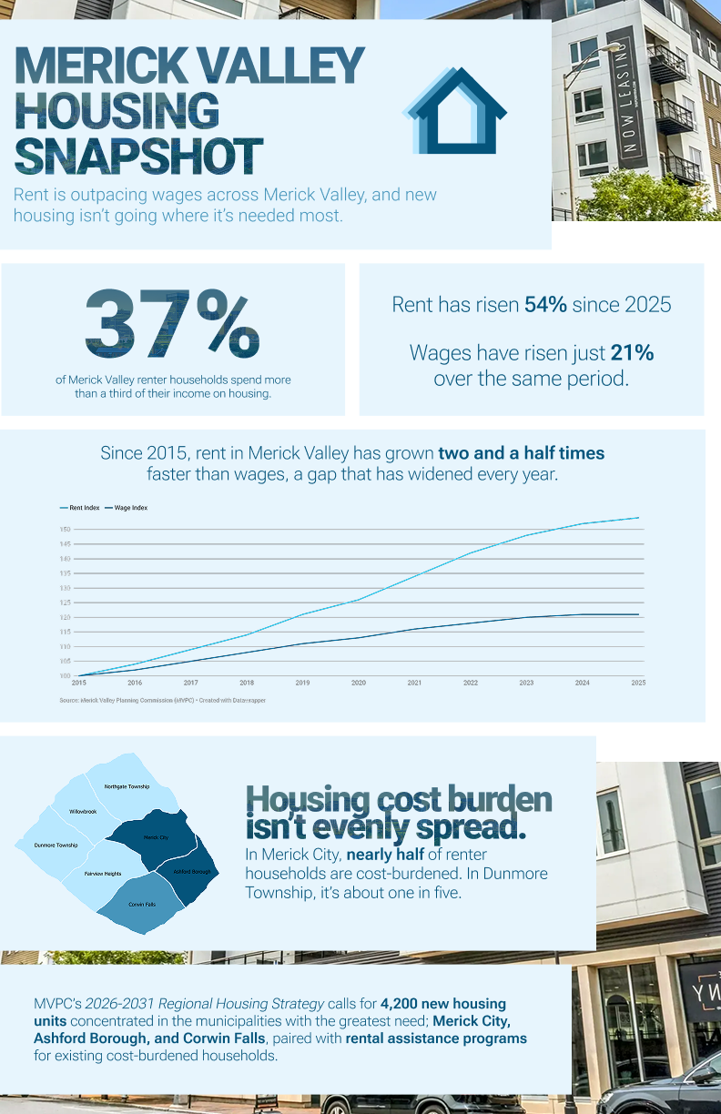
The underlying data told a clear story: rent in Merick Valley has risen 54% since 2015, while wages grew just 21% over the same period, leaving over a third of renter households cost-burdened. But that story was buried across dozens of pages of tables and narrative text. The goal was to surface the single most important finding and support it with just enough data to be credible — without overwhelming the reader.
-
My Approach:I started with the numbers, not the layout. I identifyied which three or four data points actually carried the story, then built a visual hierarchy around one plain-language headline. A large number callout anchors the page, a line chart shows the rent-versus-wage gap widening over a decade, and a simplified map shows how unevenly that burden is distributed across the region. Every element was designed to work as a standalone social crop as well as part of the full page, so the same asset could be repurposed across formats.
-
Outcome:The finished piece pairs with the full housing study as a print-ready handout and a digital one-pager, giving MVPC a companion asset they can attach to reports, hand out at public meetings, or post directly.
-
Skills Demonstrated:- Translating quantitative reports into plain-language visual communication
- Information hierarchy and editorial judgment (deciding what not to include)
- Data visualization design (chart + map + stat callout in one cohesive system)
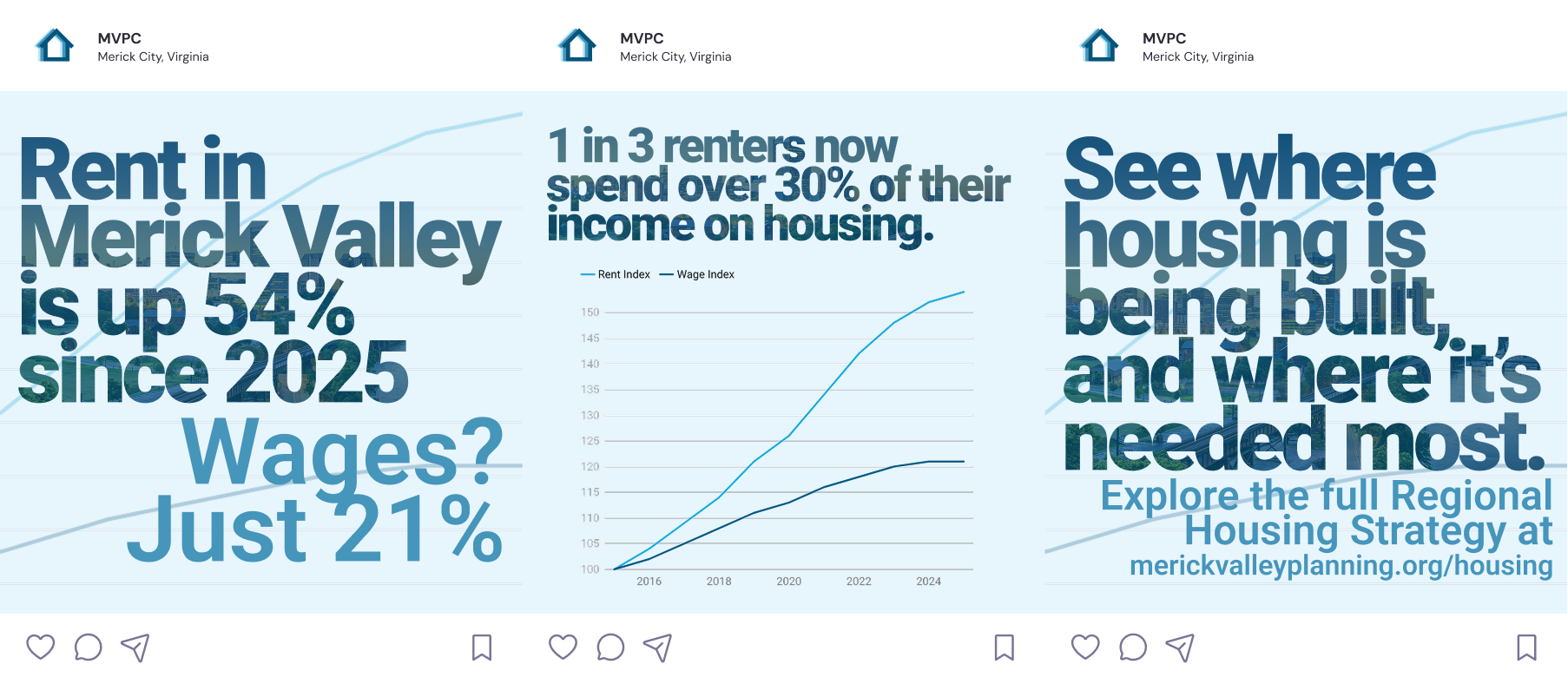
This format utilizes the data differently. Social media demands brevity and a scroll-stopping hook before any context is established. This format doesn't tolerate the density that made the original infographic work — the challenge was figuring out what to cut, not just how to resize.
-
My Approach:I treated the carousel as a three-beat structure — hook, evidence, action — rather than a shrunk-down infographic. Slide one leads with the single most surprising number with no chart at all, slide two earns that number with a simplified visual, and slide three converts attention into a next step.
-
Outcome:The result is a small system rather than a one off asset. A report-ready infographic and a shareable social sequence, both drawing from the same three data points but built for how each audience actually consumes information.
-
Skills Demonstrated:- Adapting a single data story across print and social formats
- Editorial compression; deciding what survives at each size and distance
- Brand and typographic consistency across a multi-format campaign
Meridian Coffee Co.: Brand Identity and Web Design
A self-initiated exercise in building a cohesive brand identity across print and digital touchpoints. Starting from scratch, from logo mark through business collateral to a responsive website.
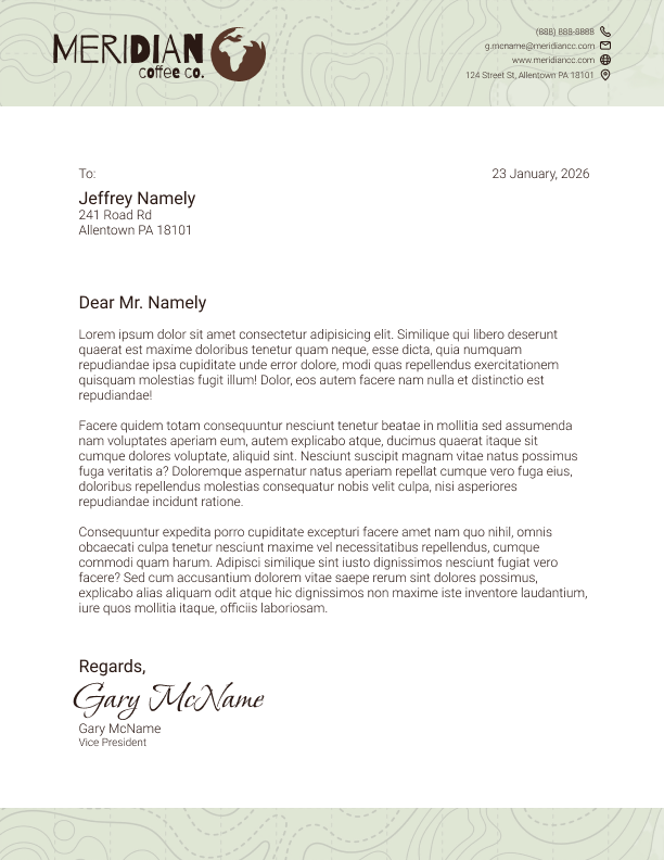
A brand's personality often disappears the moment it hits an official document. Letterheads default to sterile, corporate templates that feel disconnected from everything else the brand stands for. Meridian Coffee Co. needed a letterhead that could carry formal correspondence (client letters, partnership agreements) while still feeling like it came from a coffee company built on origin, craft, and sustainability.
-
My Approach:I anchored the design around the brand's topographic line motif — a subtle nod to the geography and terrain coffee is grown in — using it as a soft background texture rather than a literal illustration, so it added warmth without competing with the letter content. I kept the header restrained: logo, contact block, and a clean sans/serif contrast for hierarchy, so the page still reads as professional correspondence at a glance. A muted sage-and-brown palette pulled directly from the logo tied the piece back to the rest of the identity system without needing to repeat the mark more than once.
-
Outcome:The result is a letterhead that functions as serious business correspondence while still feeling unmistakably like Meridian — proof that a brand's warmth doesn't have to be sacrificed for formality.
-
Skills Demonstrated:- Brand identity application
- Print layout & hierarchy
- Color systems & texture design
- Typography pairing
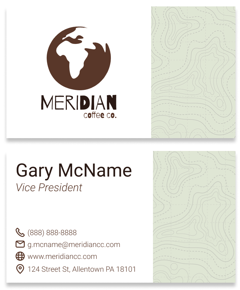
A business card is often the first physical touchpoint someone has with a brand, and the only real estate to make an impression before it ends up in a drawer or a wallet. Meridian needed a card that communicated credibility (name, title, contact info) while still hinting at the brand's origin-forward, earthy identity within a very tight space.
-
My Approach:I split the card into two clear zones: a clean, left-aligned contact block on white for maximum legibility, and the topographic pattern filling the right half to give the card a distinct visual signature even before you read a word. Icon-led contact details (phone, email, web, location) kept the information scannable rather than list-heavy, and I mirrored the same texture and color palette from the letterhead so the card would feel like part of a system, not a standalone piece.
-
Outcome:A card that reads as clean and professional at a glance, but leaves a distinct visual impression thanks to the branded texture — reinforcing recall in a format where most competitors default to plain white.
-
Skills Demonstrated:- Brand identity application
- Small-format layout design
- Iconography
- Print production awareness
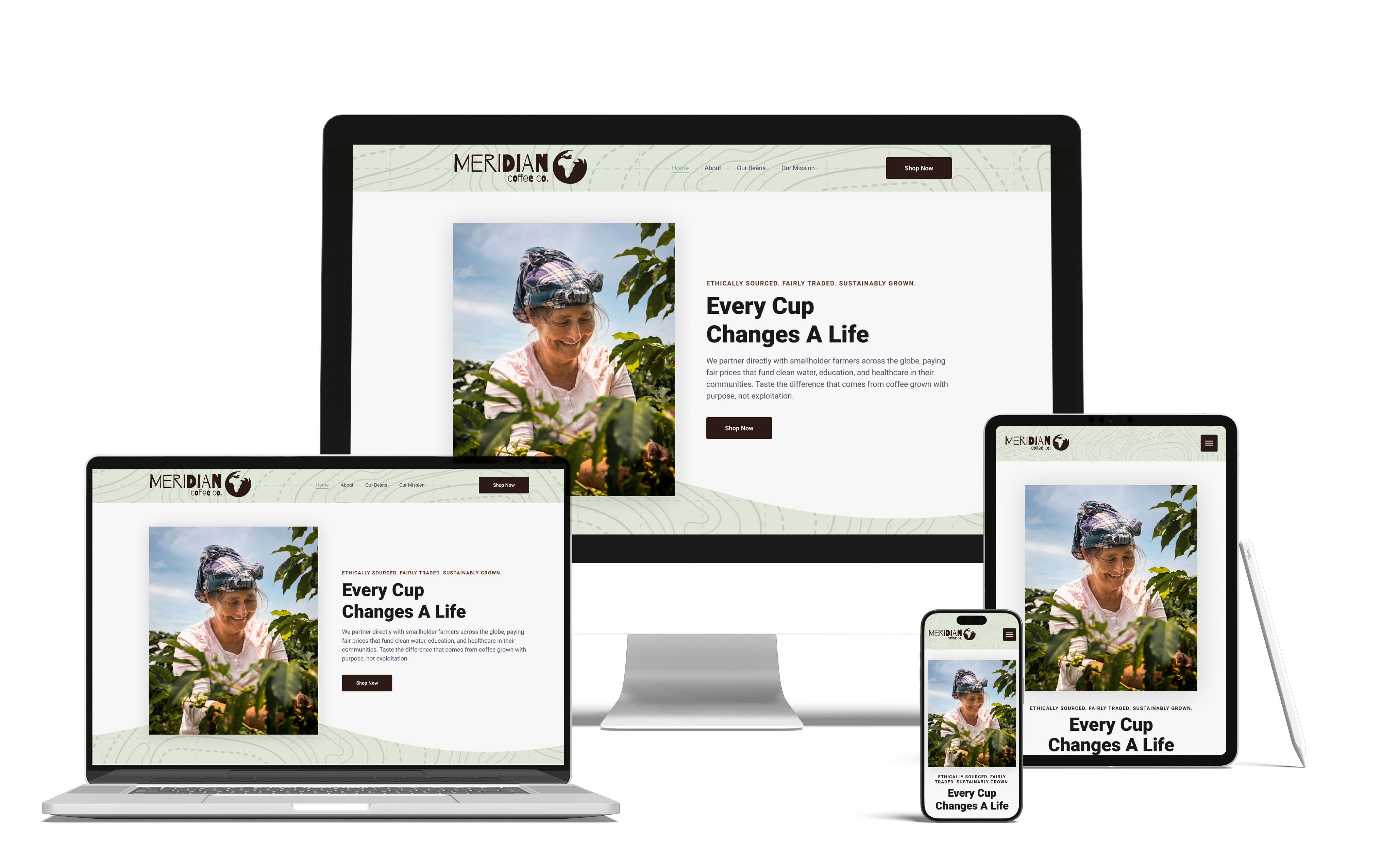
Meridian's brand story — direct trade, farmer partnerships, sustainability — needed to come through immediately on the website, not just in an "About" page buried in navigation. The homepage had to work as both an emotional entry point and a functional e-commerce hub, and needed to hold up cleanly across desktop, tablet, and mobile.
-
My Approach:I led with a hero section built around a portrait of an actual coffee farmer at work rather than a styled product shot. This put the people behind the brand's direct-trade claim front and center instead of asking customers to take it on faith. That image sat alongside a message-first headline ("Every Cup Changes a Life") and a short line on the direct-trade model, so the emotional case was made before any product appeared. The navigation stayed simple and story-first (Home, About, Our Beans, Our Mission) with a single persistent "Shop Now" CTA, so visitors could explore the mission at their own pace without losing the path to purchase. I carried the topographic texture and earthy palette from the print pieces into the site's header treatment, keeping the identity consistent across every touchpoint, and designed the layout mobile-first so the hero photo and message would reflow cleanly rather than just shrink.
-
Outcome:A homepage that opens with a real face and a real story, and closes with a clear path to purchase. It's consistent with the print identity system, and functional across every device it was tested on.
-
Skills Demonstrated:- Responsive web design
- UX/UI design
- Brand-to-digital translation
- Visual hierarchy & conversion-focused layout
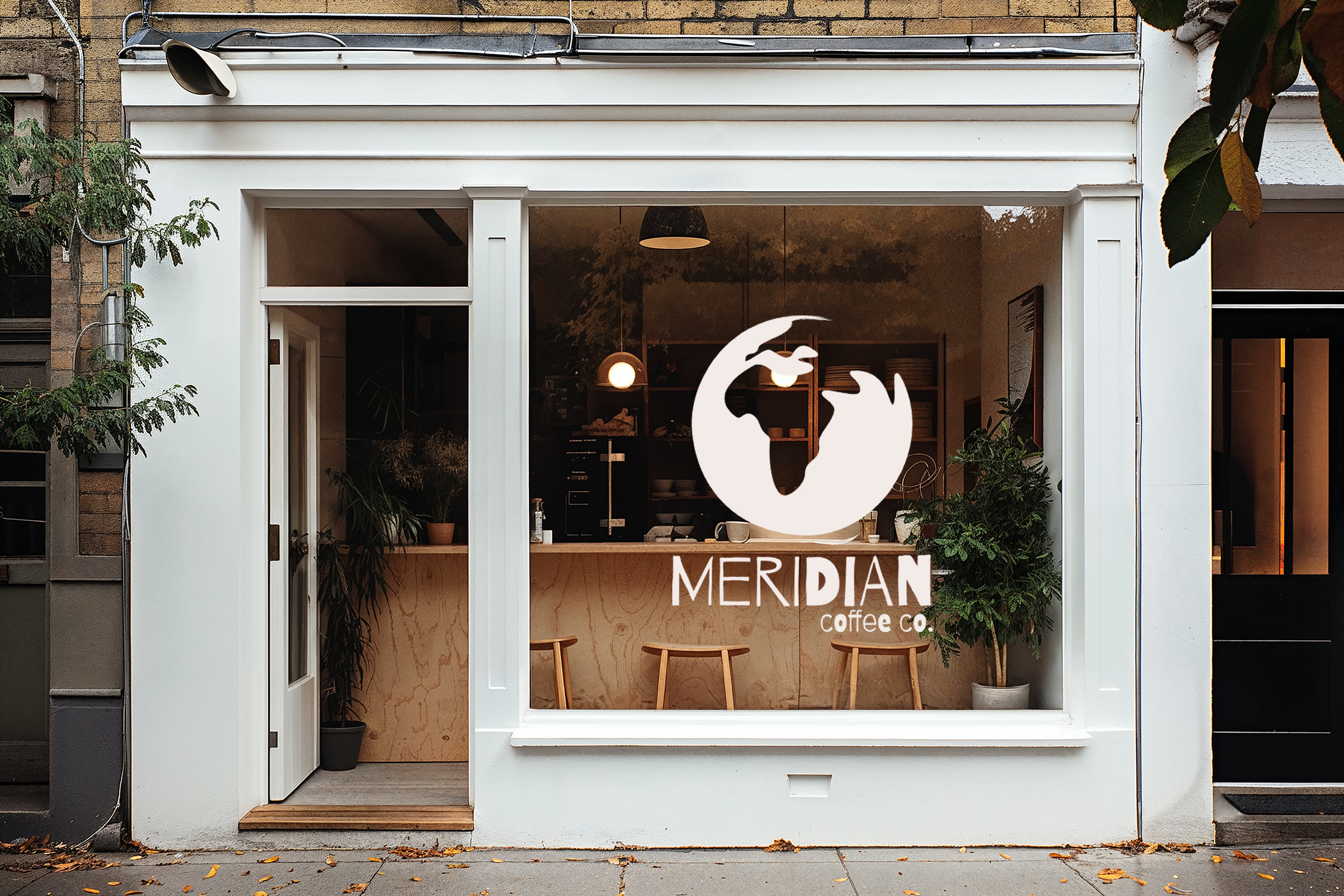
A brand identity can look polished in a deck and still fall apart the moment it's applied somewhere unpredictable — a window, in ambient light, competing with a real street and real foot traffic. Meridian's mark needed to be tested outside its controlled print and digital environments to confirm it could function as physical signage: legible, recognizable, and inviting from the sidewalk.
-
My Approach:I applied a simplified, single-color version of the logo lockup — the earth mark paired with the wordmark — directly onto a storefront window, sized and positioned to read clearly against the shop's interior rather than fighting it. Using a mockup rather than a flat rendering let me stress-test the mark under real conditions: glass reflection, warm interior lighting, and an architectural frame the brand had no control over. Keeping the application to a single clean color (rather than the full brown-and-sage palette) was a deliberate choice, since window decals need to hold contrast and legibility regardless of what's happening on the other side of the glass.
-
Outcome:The mockup confirmed the identity could scale beyond collateral and screens into physical retail signage without losing recognizability; the final proof point that the system was built to travel, not just to look good in a portfolio.
-
Skills Demonstrated:- Environmental and signage design
- Logo Adaptability
- Brand system stress-testing
- Mockup/presentation design
Internal Infographics: Security Awareness & Website Performance
Two infographics built for real employees to print on their own office printers. A spam/phishing awareness poster and a website SEO report. Both were designed under the same constraints: tight budget, mixed print quality, non-specialist readers.
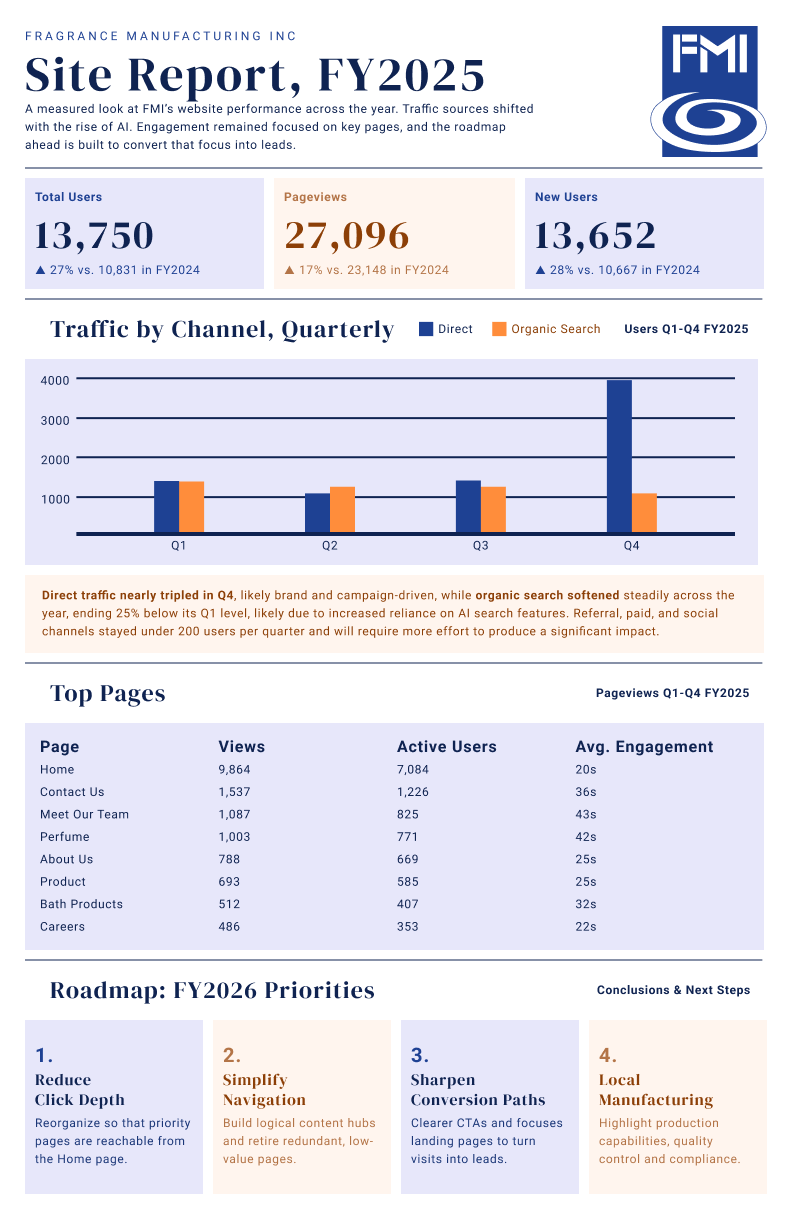
Leadership needed a clear picture of how the company website performed over the fiscal year — but the source material was a spreadsheet of raw analytics exports: traffic totals, channel breakdowns, page-level engagement, all disconnected from any narrative. Without a synthesized view, the data risked being skimmed once and forgotten, and the "so what" for the year ahead would get lost.
The challenge wasn't just visualizing numbers, but identifying the story inside them and building a document non-technical stakeholders could read in under two minutes and act on.
-
My Approach:I started by digging into the raw metrics: total users, pageviews, and new users. Organic search was steadily declining while direct traffic spiked sharply in the final quarter.
From there, I structured the report around three questions any stakeholder would ask: How did we do? Where is our audience actually going? What do we do next? That became the report's backbone — headline metrics up top, a quarterly channel comparison with a callout interpreting the shift, a top-pages table showing where engagement was concentrated, and a four-point roadmap translating the findings into next steps.
-
Outcome:The final report distilled a year of analytics into a single page that stakeholders could read and immediately understand where traffic was coming from, what was working, and what the next fiscal year's priorities should be. The roadmap section gave the team a direct bridge from "here's what happened" to "here's what we do about it".
-
Skills Demonstrated:- Data analysis & narrative synthesis
- Information design & data visualization
- Editorial hierarchy and content structuring
- Typography and restrained color systems
- Stakeholder-focused communication design
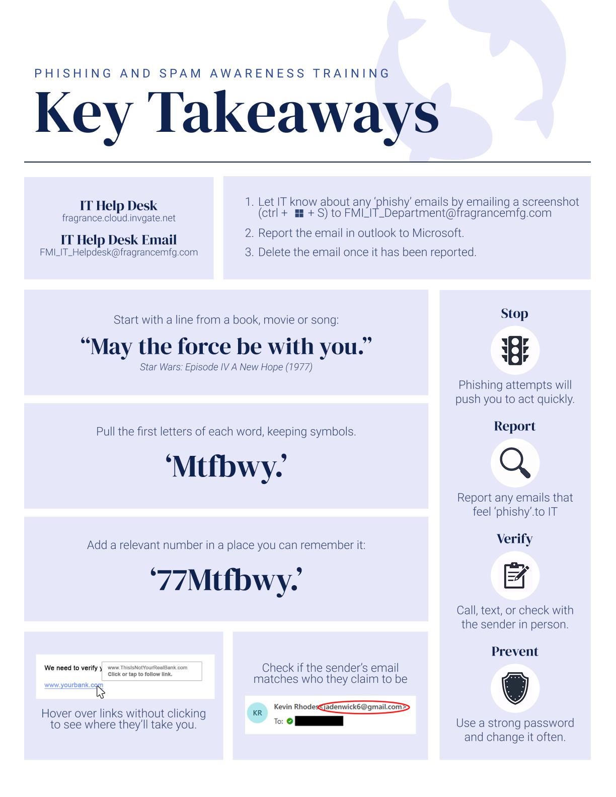
Standard phishing training tends to be forgettable; slideshows that employees skim once and never revisit. The organization needed a single reference that would actually stick: how to build a secure password, spot a phishing attempt, and know what to do about it.
-
My Approach:I researched low-friction habits over abstract rules — a mnemonic password method (phrase, punctuation, number) walked through step-by-step, and the two checks people can realistically make in the moment: hovering over links and verifying sender addresses, each shown with a mocked-up example.
I distilled the response process into a four-step Stop, Report, Verify, Prevent framework, each paired with an icon so the piece could work as a quick-reference poster. A consistent icon language and block layout let it be scanned in sections, with a fish motif keeping the tone approachable.
-
Outcome:A single-page reference that turns password hygiene, phishing recognition, and incident reporting into habits an employee could recall weeks later with concrete examples in place of abstract warnings.
-
Skills Demonstrated:- Instructional design & information hierarchy
- Iconography and visual systems
- Security/UX writing
- Research synthesis
Have a project in mind?
I'm always up for turning a hard problem into something clear, considered, and worth looking at twice. Whether it's a brand starting from scratch or a system that needs a second look, let's talk about what you're building.
Get In Touch